Catterplots and Pie Charts
Florence Nightingale invented the pie chart - how cool is that?
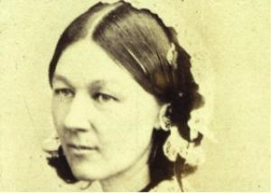
Week 2 of my 10 week statistics class - Quantitative Research in Capella University's PhD program. I'm still a bit anxious, of course. What writer isn't? The on-line community is helpful and supportive. I am even learning some fun facts. Florence Nightingale was the pioneer of modern nursing, but she also pioneered the visualization of data, and invented the familiar pie chart. What would we do without that? I have an admiration and awe for nurses. There are a few nursing students in my research classes and they are always posting on time or ahead of schedule with thorough, accurate discussions and talk about what they are doing in their lives of being a nurse and teaching other nurses. Life-saving heroes with not a lot of room for mistakes.
This week we are learning about a histogram, which is a visual representation of data. It is different than a bar graph in that it shows continuous data, with all the bars next to each other.

My statistics book is written by an author that has a sense of humor. He inserts side notes and is a cat person, so that is a plus. A box-whisker diagram is a statistic surrounded by a box and sticking out of the top and bottom of the box are two whiskers which sow the top and bottom 25% of scores.


Yes this is a fun sideline, which should never be used in class since it is "chartjunk" - the 'junking' up of academic data with fancy colors and designs. Academics like statistics to be clear and readable, plain black and white mostly. But that doesn't mean I can't have fun in the off-times playing with scatter plots with cats!


Comments
Post a Comment